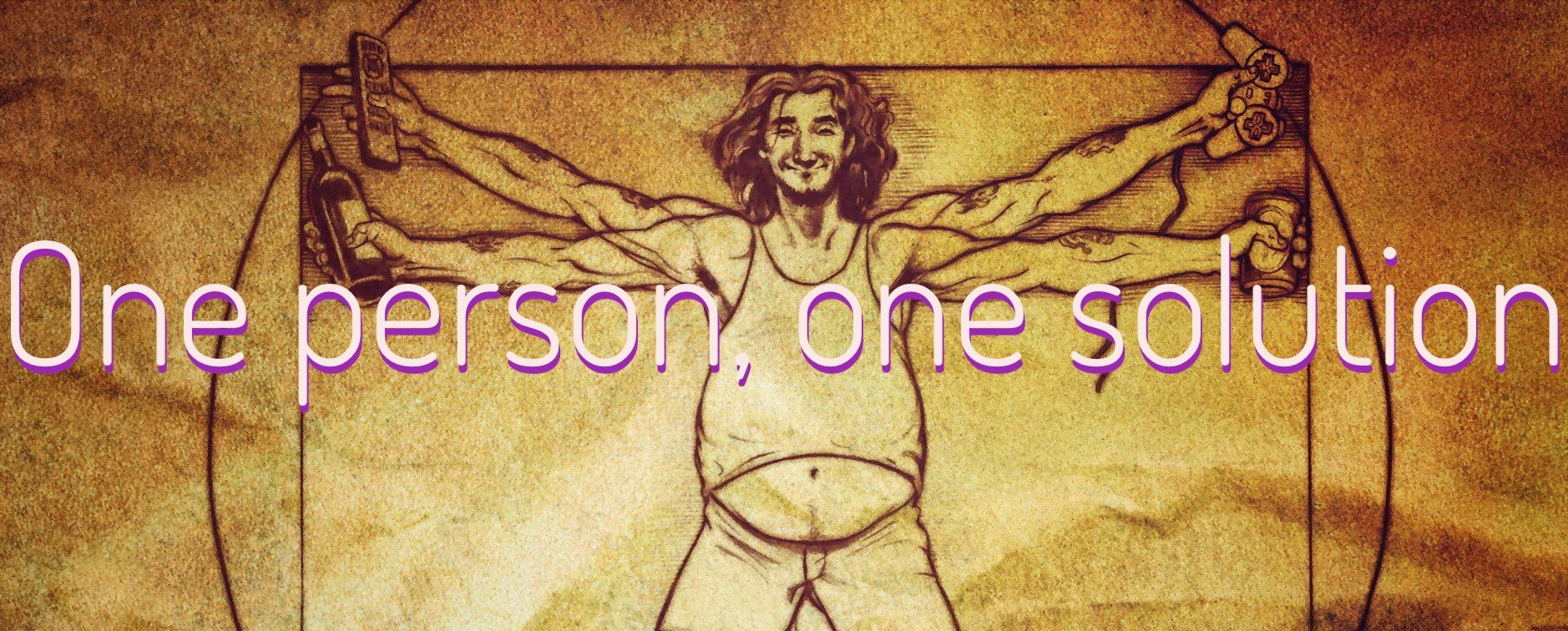
One Person, One Solution

I’ve been repeatedly confronted with the idea of “one size fits one” design philosophy. The very short idea is that “one size fits all” is a myth and designing for a mythical “perfect person” will result in a mediocre experience for everyone.
Which, if you think of the diversity of even obviously things - like size or weight - thinking you could make a shirt that would fit everyone is ludicrous. Why we try to take the same approach to workflow design in software is beginning to feel as ridiculous to me.
One Size Fits Some
Take theming as an obvious example. I’m a big fan of red but a red theme in software can be harsh to look at over the course of a day. A friend of mine, however, finds red easier to focus on, especially if environmental lighting is low, and hard no issue using red themes for hours.
One Size Fits One
We understand intuitively that aesthetic choices are personal in a meaningful way. Aesthetics may not have a HUGE effect on productivity but they definitely have SOME effect.
So why do we not consider the same thing regarding workflow design? Most modern jobs are incredibly flexible. The outcomes generally have a consistency but the path from start to finish rarely follows the same steps every time.
Would it not stand to reason that workflows that function one way may only work for one person? I mean this is even before you consider that not everyone can use the TOOLS of input the same - have you ever tried using an ergonomic mouse with the wrong hand?
Designing for one type of person is designing for that type of person. People vary in all sorts of ways. Accessible design is looking at those differences specifically so that you can create a system that adapts to the user, not one where the user must adapt.
People don’t fit into a single shirt. Why would they fit into a single workflow?
Published on October 5, 2023