iOS Liquid Glass and forever waiting for accessibility keynotes....
WWDC started today and I was looking forward to the keynote. I managed to stay spoiler-free ahead of it with the exception of the glass/visionOS style UI changes expected. VisionOS does some interesting things with opacity, highlight, color, and contrast that still allow for a surprisingly accessible experience with the headset. That coming to the other operating systems seemed super interesting.
Watching the keynote, I was struck by two things.
- The animations were really fluid but when they filled the screen they made me slightly dizzy.
- Contrast looked.. uh... lacking in some of the hero shots.
I posted a few concerns about on Mastodon but, given Apple's track record with accessibility, I was still optimistic.
Sitting down after work, numerous folks posted this WWDC session link introducing the UI further: Liquid Glass UI Session
I was very pleased to see that three core visibility settings seem to be accounted for in this overview.
- Reduce transparency.
- Increase contrast.
- Reduce motion.
I personally use the last 2 and occasionally toggle the 1st when I new update drops to see if I like the differences. Overall, my vision is good enough that I prefer the more transparent styling in current iOS.
There's not a lot to go of off... the accessibility settings are discussed in the literal last minute of the video but they seem well considered.
Reduce Transparency
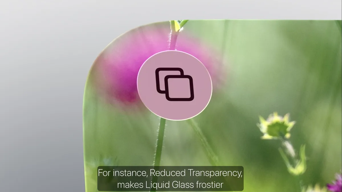
The glass Ui becomes more frosted when you have "reduce transparency" enabled while still maintaining any tinting the app or background may offer. It helps ensure UI elements are visible even in cases where the background is very stark and static.
Increase Contrast
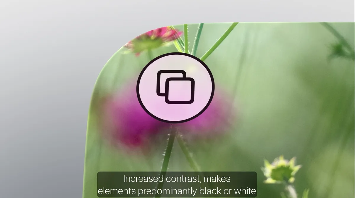
So this makes e especially happy. Increase contrast affects 3 things, I think:
- Line weight
- Icon color
- Control border
Line weight
I'm not a developer so am only going off of how I understand some of the OS to function here as an accessibility expert. I have enough dev experience to be annoying to my dev teams.
So this is where making all the icons be essentially variable fonts means the thickness of the lines are all manipulable and, I assume, relative to app decisions. So if you have, say, a 400 line weight typically, I'd imagine increase contrast would increase the line weight to 6 or 800.
It also adds a contrasting border to the while element to ensure the contrast between the color field, the border, and the control color field can all meet contrast standards (I assume WCAG standards?) in comparison to each other without affecting things like tinting as a design signature for an application.
Reduce motion
Can't really capture this in screenshots but the liquid, bubbly bits seem to be reduced. Element changes were less like.... squishy and more faded between states. At least here, I didn't personally have any dizziness with the full screen view of the reduced motion actions. The example was really basic so full effects remain to be seen for, say, full screen animation.
But... again. I'm optimistic. While I dislike it was the literal last minute in the session but it was there and it looks great.